Typography For Effective Web Design
Beyond aesthetics, typography shapes the user experience on your website and should reinforce your brand identity. As a web designer who serves small to medium size businesses, I want to delve into best practices of typography for the web.
Establishing the Mood
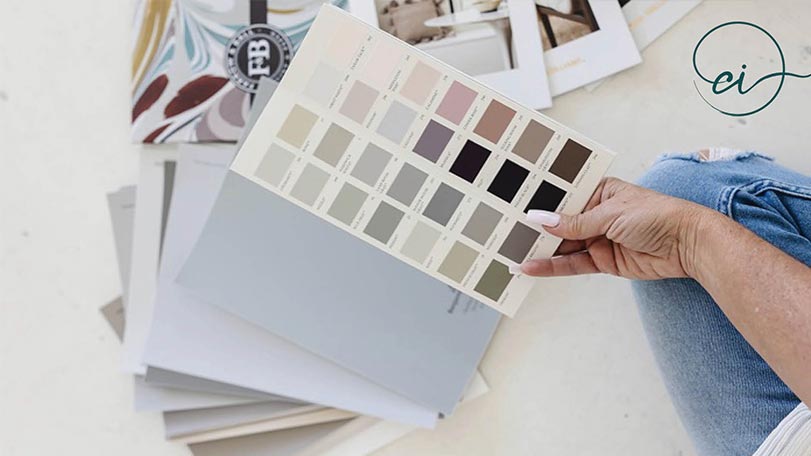
At first glance when landing on your website, typography sets the tone, whether it's a modern sans-serif font with a clean professional look or a whimsical, romantic, feminine script font evoking a feeling of expression and creativity the choice of typography sets the initial impression of your website and should align with your brand vibe.

Improving Clarity
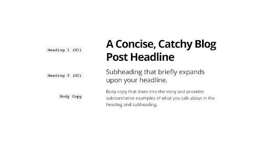
Your website exists to engage, inspire, and drive action, so legibility is important to getting your message across. Your website is visual representation of your professionalism. Factors such as font size, line spacing, line lengths, and contrast between text and background affect the browsing experience for your audience. Establishing clear hierarchy and contrast between different levels of text (e.g., headings, subheadings, body text) by varying font sizes will allow users to easily and quickly digest your content and scan for relevant information. (people don’t want to read your website) Larger font sizes should indicate higher importance or hierarchy, while smaller font sizes can denote secondary information. Copy itself should be as concise as possible.
Building Brand Identity With Type
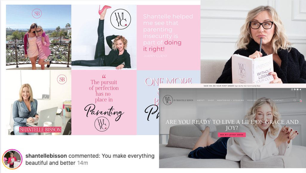
Consistent use of typography across various touch points – from the website to marketing materials reinforces brand recall. Custom typography or bespoke font choices further distinguish a brand from its competitors, contributing to its uniqueness and memorability.
Following Best Practices
- Font size is a crucial aspect of web design that directly impacts readability, accessibility, and user experience. Implementing best practices for font size ensures that your content is easily readable across various devices and screen sizes. Here are some guidelines to follow:
- For your main text, setting it to 16 pixels (px) hits the mark perfectly—it's widely regarded as a best practice. This size ensures your content is comfortably readable on both desktops and smartphones.
- As for the length of your lines, aiming for 50-75 characters is the sweet spot. It helps avoid straining your readers' eyes. Plus, tweaking the line spacing to about 1.4 to 1.6 times the font size adds that extra layer of comfort. This little adjustment significantly boosts readability, reduces eye fatigue and makes your content not just easy to read but also more enjoyable.
Conclusion
Typography does more than just look good; it's key to how we connect, engage, and express our brand. It's not just about making things readable or setting the mood; it's about using text to present information clearly, evoke feelings, and guide users through their online journey. Typography touches every part of how users interact with a website. By being intentional about the subtleties of typography and making the most of its capabilities, web designers can create a delightful user experience.